St. Mark’s Greek Fest

HELPING A LOCAL GREEK CHURCH TURN ITS EVENT INTO A SUCCESS.

Summary:

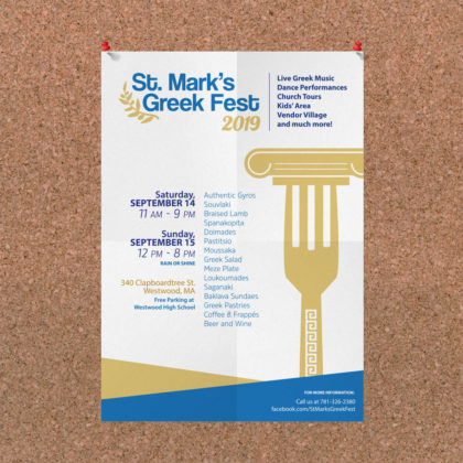
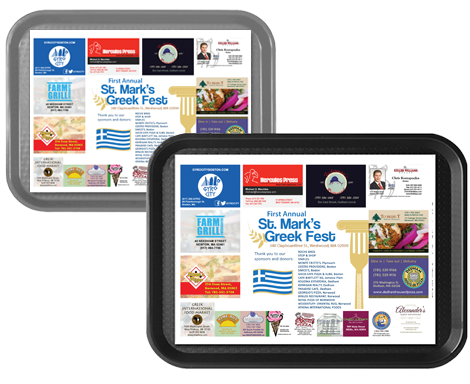
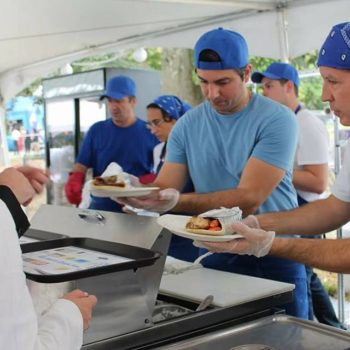
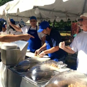
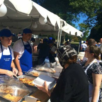
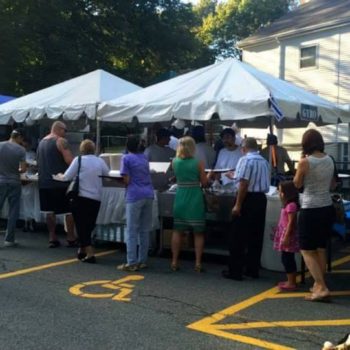
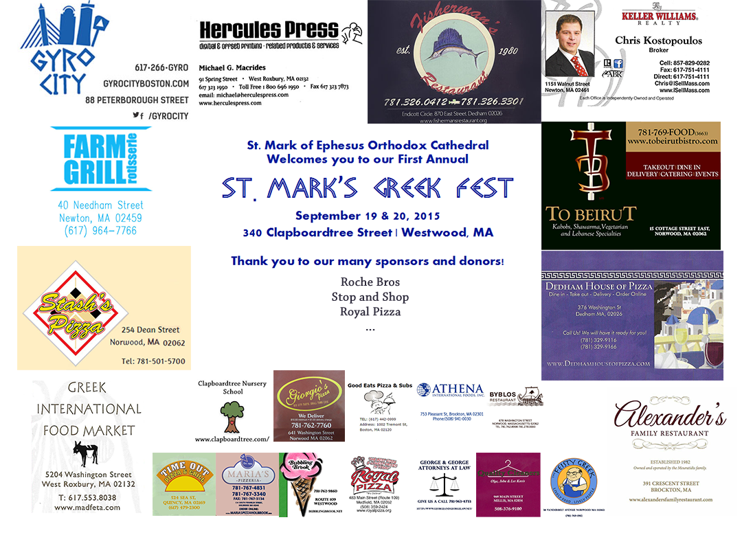
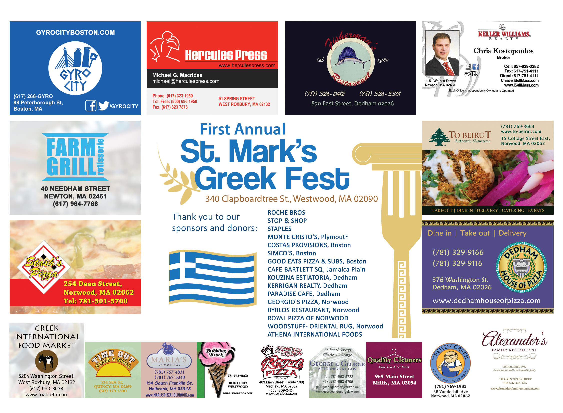
A close friend of mine approached me about his local church needing printed materials for hosting their first Greek Fest. After getting in contact with them, I was tasked with designing the event’s logo along with all their printed materials such as flyers, posters, placemats, and menus. The event has been going 10+ years since we started working together.

Tools Used:

Adobe Photoshop
Adobe Illustrator
Adobe InDesign

Event Logo Design

While initially not a high priority, the logo ended up being the most important piece. It is what established the rest of the look and feel for the event. The direction I chose was modern and clean. I avoided using cliche fonts that stereotype the Greek culture. Coolvetica fit the criteria perfectly with a golden olive branch.

Primary:
Greek Blue
Secondary:
Pale Gold
Supporting:
Dark Blue
Supporting:
Dark Gold

Flyers & Posters

Next I worked on designing the poster for the event. Admittedly, the fork pillar is not an original concept but the hand-drawn version I made supplemented the style really well.

Menu Trifold & Poster

For the text-heavy design of the event menu, InDesign was the best tool for the job with its extensive command over paragraph and character styles. The menu went under the most edits due to the rise and fall of forecasted cost in the ingredients needed at the event.

Placemats

Originally, I was handed a psd file containing the draft that a family friend had made for them. It was evident that in order to remain consistent on the modern visual theme I had to go into each sponsor’s ad (for which I got approval) and change it to be more visually appealing and readable.

Menu