


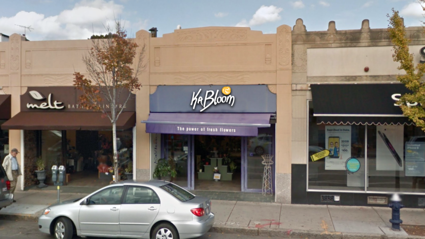
KaBloom Rebranding Concept
As part of an interview process, I was tasked with re-branding the flower shop KaBloom to show a test of my skills. The original logo was either handwritten or used a very obscure script typeface. The style reflects heavily in the late 90s early 2000s logo design.
Rebranding
The characteristics I wanted to preserve were:
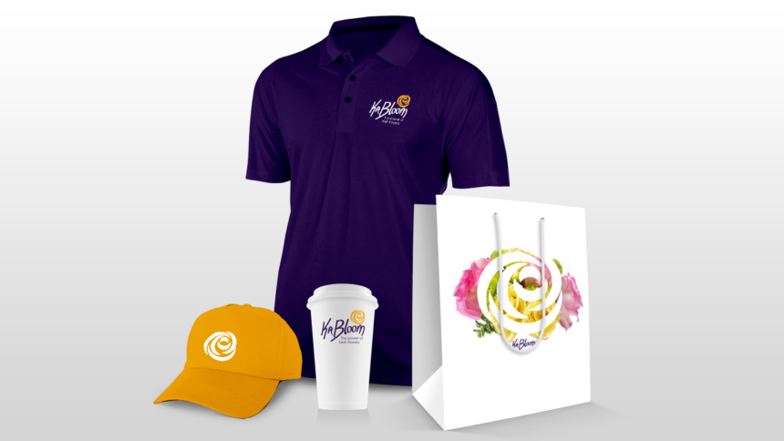
I hand wrote several iterations of the KaBloom logo on a sheet of paper, holding the pencil in different ways. After finding the general look and feel I scanned and traced the strokes with the pen tool then proceeded to tweak it with different stroke widths and brush styles. The rose was composed of several leftover crescents in Illustrator. The rose still retained that explosive look, but the characteristic was now more prominent in the typeface.


