


POSTER DESIGN PROCESS
This project was from half-semester long refinement process during my Graphic Design course in college, so it’s very rough around the edges, but I believe it is still worth showcasing due to the documented revisions of the poster.
Assignment:
Pick a show/play/book and design poster centered around a theme.
The design must be driven by a main word or words which could sufficiently summarize a theme in the story.
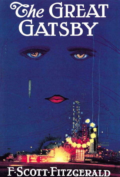
The Book:
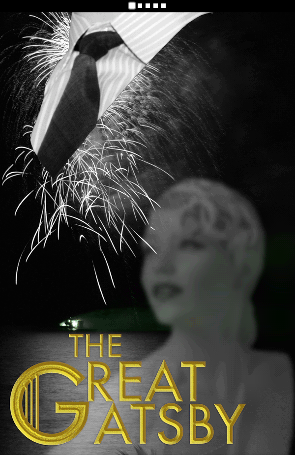
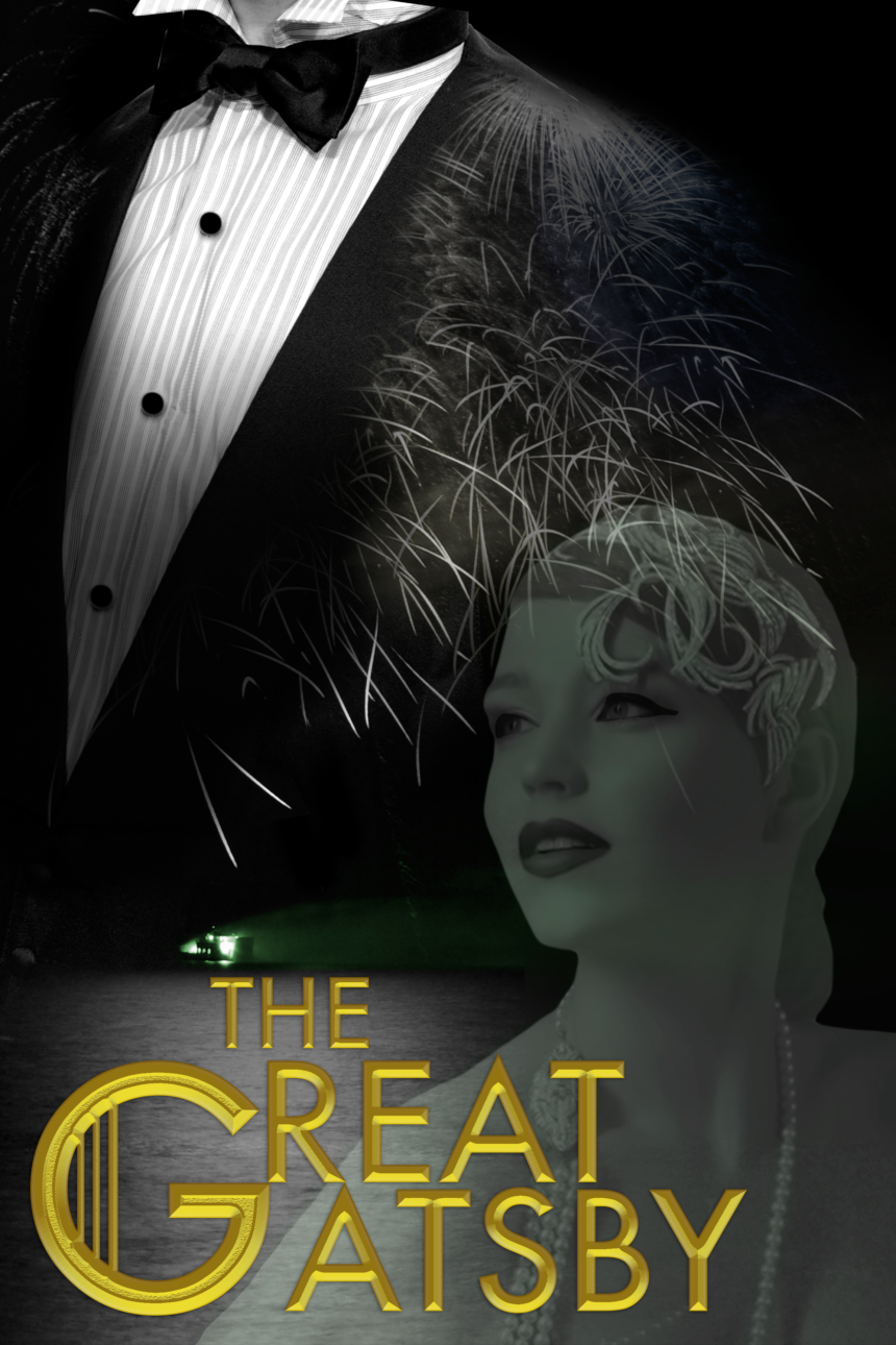
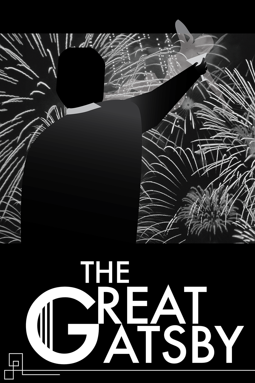
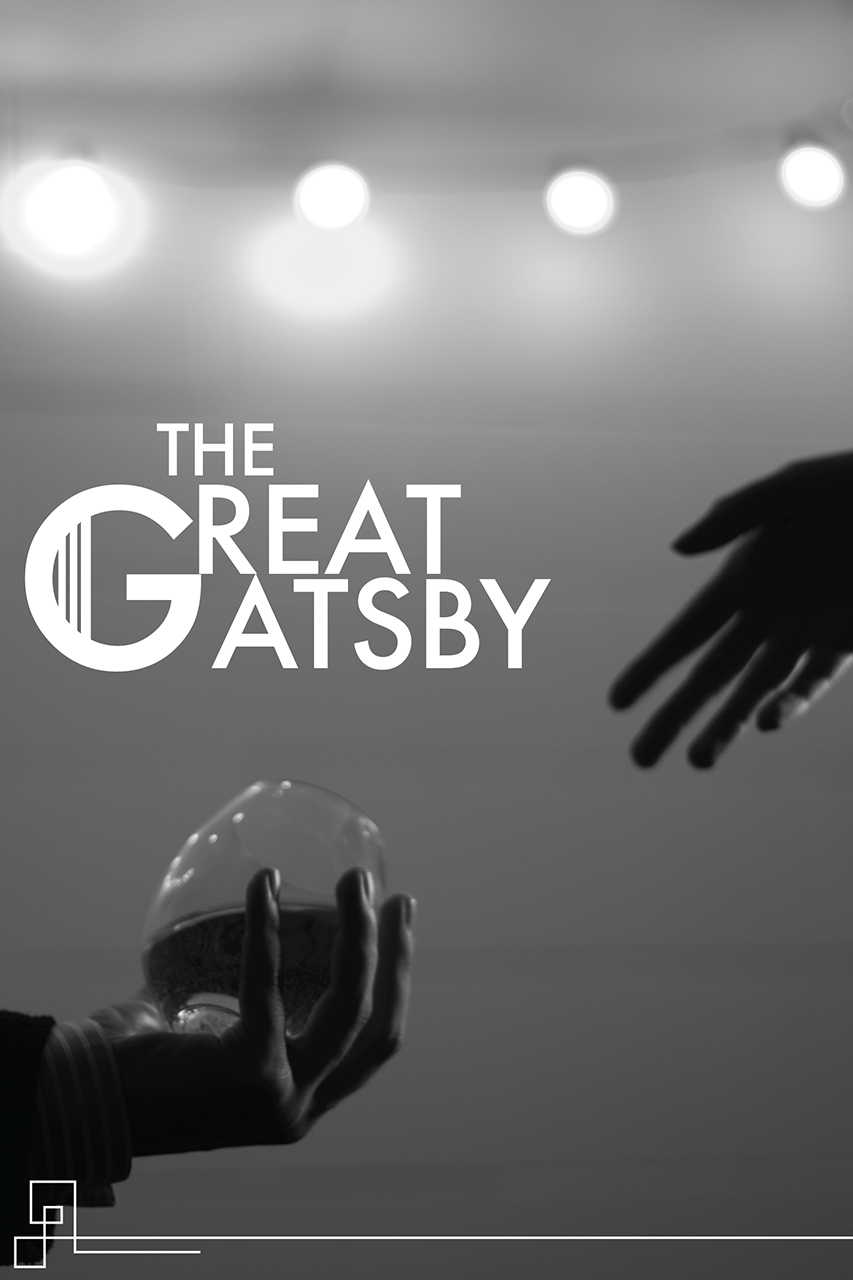
I selected The Great Gatsby as my source material. I centered my work around the words GRAND and DIZZYING. The elements I wanted to include involved Gatsby’s stature, the green light, alcohol, and how vapid and out-of-reach Daisy was.
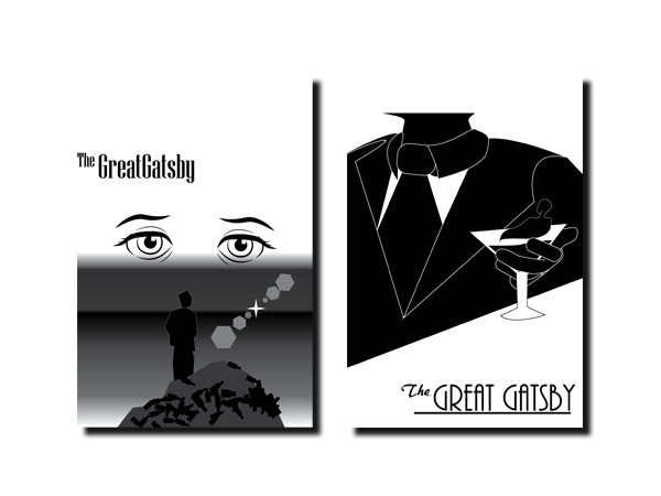
Sketches Set One
Sketching rough work proved challenging since a lot of the ideas I was drawing from were based off Like Minded Studio’s work with The Great Gatsby Movie. During the sketch process, we were required to keep the posters in black & white format as to not get distracted by color.
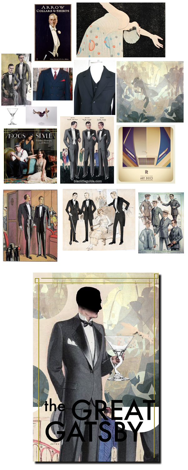
My instructor encouraged me to switch over to Photoshop and use reference materials of artwork and fashion from the 1920s to help me steer in the right direction.
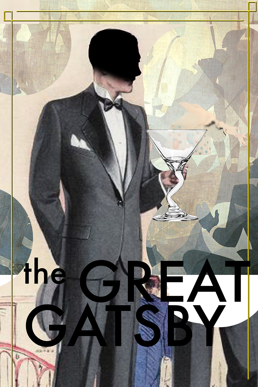
Refinement:
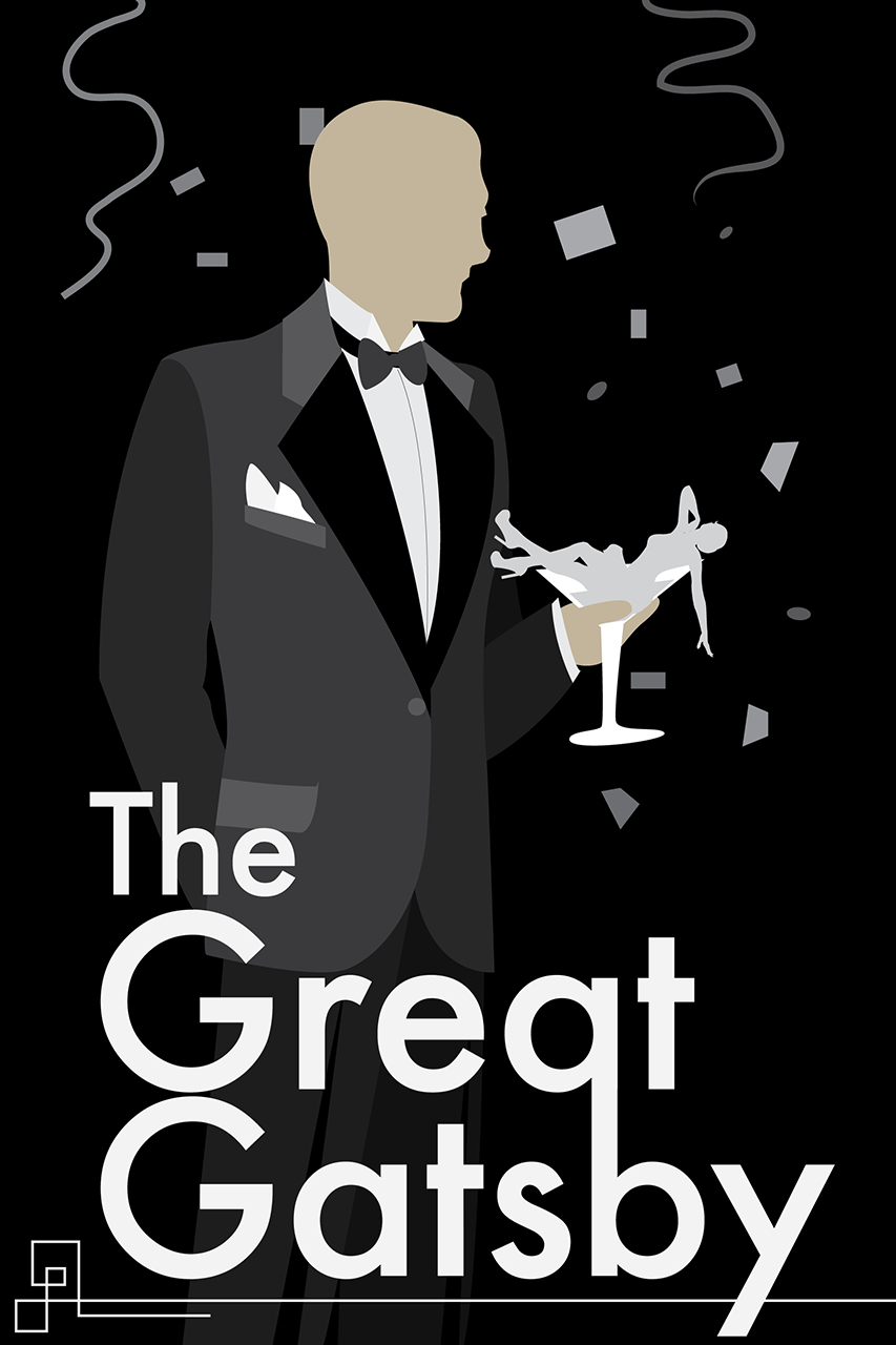
Now that I had the layout and concept ready, all that was needed was to get all the elements just right. I had saved each revision individually after each round of critique so I could show the process of perfecting a piece.
Elements that were tuned:
- Daisy’s blurriness to signify her being unobtainable and out of reach
- Daisy’s red lips to symbolize lust and short lived fling
- Gatsby’s suit, switching out 3 piece suit with tie for tux and bowtie
- Green glow from the green light reflecting off Daisy’s complexion
- Containing the fireworks within Gatsby’s suit or letting them spread
- Firework spark on Daisy’s face to symbolize tear or sweat


